
Exploring Color Psychology: Picking the Perfect Palette for Your Home
Choosing the right color palette for your home design is an essential aspect of creating a harmonious and aesthetically pleasing living space. The colors you choose can have a significant impact on the overall atmosphere and mood of your home, as well as on your own emotions and well-being. This is due to the powerful influence of color psychology, which is the study of how colors affect human behavior and emotions. By understanding the principles of color psychology and applying them to your home design, you can create a living environment that is not only visually appealing but also conducive to your mental and emotional well-being.
One of the first steps in selecting the perfect color palette for your home is to consider the function and purpose of each room. Different colors can evoke different emotions and psychological responses, so it’s important to choose colors that are appropriate for the intended use of the space. For example, warm colors such as red, orange, and yellow are known to stimulate the senses and promote feelings of warmth, comfort, and energy. These colors may be suitable for social spaces such as living rooms and dining rooms, where you want to create a welcoming and lively atmosphere.
On the other hand, cool colors such as blue, green, and purple are known to have a calming and soothing effect on the mind and body. These colors may be more appropriate for bedrooms and bathrooms, where you want to create a peaceful and relaxing environment. Neutral colors such as white, gray, and beige can also be used to create a sense of balance and harmony in your home, and can be easily combined with other colors to achieve the desired mood and atmosphere.
Another important aspect of color psychology to consider when choosing your home’s color palette is the impact of color on the perception of space. Light colors can make a room appear larger and more open, while dark colors can make a space feel smaller and more intimate. If you have a small room that you want to make feel more spacious, consider using light colors on the walls and furnishings. Conversely, if you have a large room that feels too open and impersonal, you might want to use darker colors to create a cozier atmosphere.
When selecting your color palette, it’s also important to consider the existing features and elements of your home, such as flooring, furniture, and artwork. You’ll want to choose colors that complement and enhance these elements, rather than clash with them. For example, if you have hardwood floors with warm undertones, you might want to choose a warm color palette to create a cohesive and harmonious look. If you have a favorite piece of artwork that you want to showcase, consider choosing colors that will make the artwork stand out and become a focal point in the room.
Finally, don’t be afraid to experiment with different colors and combinations to find the perfect palette for your home. You can use color swatches, paint samples, and digital tools to visualize how different colors will look in your space before committing to a specific palette. It’s also a good idea to consider the lighting in your home, as colors can appear differently under different types of light. By taking the time to explore color psychology and carefully consider the function, mood, and aesthetic you want to achieve in each room, you can create a beautiful and harmonious living environment that reflects your personal style and enhances your well-being.
Top Tips for Selecting a Cohesive Color Scheme in Your Home Design

Choosing the right color palette for your home design is an essential aspect of creating a harmonious and visually appealing living space. A well-thought-out color scheme can enhance the overall aesthetic of your home, create a sense of balance, and even influence your mood. However, with the vast array of colors and combinations available, selecting the perfect palette can be a daunting task. To help you navigate this process, here are some top tips for selecting a cohesive color scheme in your home design.
First and foremost, it is crucial to consider the architectural style and period of your home. Different architectural styles and historical periods are often associated with specific color palettes, which can serve as a starting point for your design. For instance, Victorian homes are known for their rich, dark hues, while mid-century modern homes often feature bold, vibrant colors. By taking cues from your home’s architecture, you can create a color scheme that complements and enhances its unique features.
Another essential factor to consider is the function and purpose of each room in your home. Different colors can evoke different emotions and create various atmospheres, so it is essential to choose colors that align with the intended mood and purpose of each space. For example, you may want to opt for calming, neutral tones in a bedroom to promote relaxation, while a more vibrant and energetic palette may be more suitable for a living room or kitchen.
When selecting a color palette, it is also important to consider the existing furniture, artwork, and accessories in your home. These elements can serve as a source of inspiration and help you identify colors that will complement and enhance your existing décor. Additionally, considering the colors of your home’s fixed elements, such as flooring, cabinetry, and countertops, can help ensure that your chosen color scheme works harmoniously with these features.
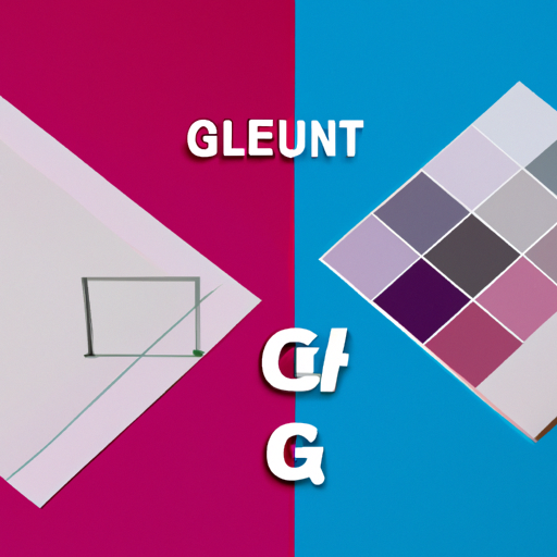
One useful technique for selecting a cohesive color scheme is to create a color storyboard or mood board. This can be a physical or digital collage of images, fabric swatches, paint chips, and other materials that represent the colors and textures you want to incorporate into your home design. By arranging these elements together, you can get a sense of how different colors and materials will work together and make adjustments as needed to achieve the desired balance and harmony.
Another helpful tip is to use the 60-30-10 rule, which suggests that your color scheme should be composed of 60% dominant color, 30% secondary color, and 10% accent color. This proportion helps create a sense of balance and visual interest in your home design. The dominant color typically serves as the backdrop for your space and is often a neutral or muted hue. The secondary color is used to create contrast and depth, while the accent color adds a pop of color and personality to the space.
Finally, it is essential to consider the flow and continuity of your home design. While each room can have its unique color scheme, it is crucial to ensure that there is a sense of cohesion and harmony throughout your home. One way to achieve this is by using a consistent color palette or incorporating similar colors and tones in different rooms. This can help create a sense of unity and flow, making your home feel more inviting and visually appealing.
In conclusion, selecting the right color palette for your home design is a critical aspect of creating a beautiful and harmonious living space. By considering factors such as your home’s architectural style, the function and purpose of each room, and the existing décor, you can create a cohesive color scheme that enhances the overall aesthetic of your home. Additionally, using techniques such as creating a mood board and following the 60-30-10 rule can help you achieve balance and visual interest in your design. With careful planning and consideration, you can create a stunning and cohesive color scheme that brings your home design vision to life.
The Art of Balance: How to Choose and Combine Colors for a Harmonious Home
The art of balance in home design is a delicate dance between form, function, and aesthetics. One of the most critical aspects of achieving this balance is the selection of a color palette that not only reflects your personal style but also creates a harmonious and cohesive atmosphere throughout your living space. With an overwhelming array of colors and combinations to choose from, it can be challenging to know where to begin. This article will provide you with valuable insights and tips on how to choose and combine colors for a harmonious home design.
First and foremost, it is essential to understand the basic principles of color theory. Colors can be classified into three categories: primary, secondary, and tertiary. Primary colors are red, blue, and yellow, which cannot be created by mixing other colors. Secondary colors are created by mixing two primary colors, such as green (blue and yellow), orange (red and yellow), and purple (red and blue). Tertiary colors are formed by mixing a primary and a secondary color, resulting in colors like blue-green, red-orange, and yellow-green. Familiarizing yourself with these color relationships will help you make informed decisions when selecting your color palette.
When choosing a color palette for your home, it is crucial to consider the mood and atmosphere you want to create. Colors have a significant impact on our emotions and can evoke feelings of calmness, energy, or warmth. For instance, cool colors like blues and greens are known to create a calming and soothing atmosphere, while warm colors like reds, oranges, and yellows can evoke feelings of warmth and energy. Neutral colors like whites, grays, and beiges can provide a sense of balance and stability. It is essential to select colors that align with the desired mood and atmosphere for each room in your home.
Another critical factor to consider when selecting a color palette is the size and layout of your living space. Light colors can make a small room appear larger and more open, while dark colors can create a cozy and intimate atmosphere in a larger room. Additionally, it is essential to consider the amount of natural light in each room, as this can significantly impact how colors appear. Rooms with ample natural light may benefit from a more subdued color palette, while rooms with limited natural light may require bolder and brighter colors to create a sense of warmth and vibrancy.
When combining colors, it is essential to strike a balance between harmony and contrast. A harmonious color scheme consists of colors that are closely related on the color wheel, such as analogous or monochromatic color schemes. These color schemes create a sense of unity and cohesion but can sometimes lack visual interest. To add contrast and depth to your color palette, consider incorporating complementary colors, which are colors that are opposite each other on the color wheel. Complementary colors can create a dynamic and visually stimulating atmosphere when used in moderation.
Lastly, it is essential to consider the existing elements in your home, such as furniture, artwork, and architectural features. Your color palette should complement and enhance these elements rather than compete with them. For instance, if you have a statement piece of artwork or a bold patterned rug, you may want to choose a more subdued color palette to allow these elements to take center stage.
In conclusion, selecting the right color palette for your home design is a delicate balance between understanding color theory, considering the desired mood and atmosphere, and taking into account the size and layout of your living space. By carefully considering these factors and striking a balance between harmony and contrast, you can create a cohesive and visually appealing home that reflects your personal style and enhances your overall quality of life.
Q&A
Question 1: What factors should I consider when choosing a color palette for my home design?
Answer: When choosing a color palette for your home design, consider factors such as the room’s purpose, lighting, existing furniture and accessories, and your personal preferences and style.
Question 2: How can I create a cohesive color palette throughout my entire home?
Answer: To create a cohesive color palette throughout your home, choose a base color that will be present in all rooms, and then select complementary or contrasting colors for each room that work well with the base color. You can also use a consistent color scheme, such as monochromatic, analogous, or complementary, throughout the entire home.
Question 3: How can I use color psychology to choose the right colors for different rooms in my home?
Answer: Color psychology suggests that certain colors can evoke specific emotions and moods. For example, blues and greens are calming and relaxing, making them ideal for bedrooms and bathrooms. Yellows and oranges are energizing and uplifting, making them suitable for kitchens and living areas. Reds can stimulate appetite, making them a popular choice for dining rooms. Consider the desired mood and function of each room when selecting colors.
Conclusion
In conclusion, choosing the right color palette for your home design involves considering factors such as personal preferences, room size, lighting, and the desired atmosphere. By evaluating these elements and experimenting with different color combinations, you can create a harmonious and visually appealing living space that reflects your unique style and enhances your home’s overall aesthetic.
